

The idea of this demonstration is to show how careful planning of glazes can produce vibrant and fresh colour, even when using all three primaries layered together. The effect you get from layering in this way is completely different from mixing the same paints together on the palette.
For this study of plums I needed a range of hues including yellow, green, red and purple. I spent some time experimenting with layering different colours and planning the order in which I would work. The chart below shows the colours I planned to use and the swatches along the bottom show the results of the different combinations.The colours would be layered starting with the yellow and working through to the violet, but not all areas would have all the layers or in the same intensity. For instance the yellow is used more lightly in the areas which will also have cobalt blue and violet to avoid the colours turning dirty green.
 |
| All paints are Winsor & Newton Artist range. |

Then Cerulean Blue is added. I add this only where I want to achieve swatches 2 and 3 on the chart.

Then Permanent Alizarin Crimson goes where I want to achieve the colour swatches 3 through to 6. Do you see how this is working?

Cadmium Red goes on next...
..then Cobalt Blue...

..and finally Winsor Violet (Dioxazine). There were just a few tiny areas that have been left unpainted until this point so they now have only pure Violet on them (the last swatch on the chart, number 8).

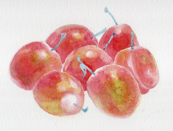
Here's the finished piece with shadows, lace and stalks added. The shadows and lace holes are all painted with colours used previously (Cobalt Blue, Permanent Alizarin Crimson, Transparent Yellow, Winsor Violet) but because here the paint has been mixed on the palette instead of being painted in layers on the paper, the result is muted neutrals rather than the vibrant colours of the plums
 |
| 'Seven Plums' - © Jane Duke 2011 |
I hope you enjoyed this demo and found it useful. Do let me know what you think in the comments below.
The legal copyright bit (sorry but unfortunately this is necessary):
You are very welcome to follow this demonstration for your own pleasure, but please remember that exhibiting or selling the resulting painting without acknowledgement is copyright infringement.
No comments:
Post a Comment
I love to hear people's thoughts on this blog, but there may be a short delay before your comment appears publicly. Thanks for your patience.