Wednesday 30 December 2015

Getting organised

'The biggest lie I tell myself is "I don't need to write that down; I'll remember it."'


When I'm in the middle of producing a print and repeating a process time and time again, it seems impossible that I won't always know how to do it. Sometimes I make a few notes on scraps of paper (which then get lost) but more often I don't. And then the same thing always happens - I go back a week or a month later to complete some more in the edition and I can't even remember how I got that ink colour, let alone how I got that texture effect or that blend of tones. I am an idiot.


In 2016 I am resolved to end this idiocy and start keeping a print recipe book. I'm going to use this sketch book from Paperchase. It fits the bill perfectly: it's attractive enough to be an incentive but not so lovely I dare not write in it. (I once gave away a beautiful hand made book because it had sat on my shelf unused for three years; it was so special I couldn't bring myself to make a mark in it).


The first recipe I've written up is for this little 'Robin' drypoint etching that I made for Christmas 2015. It's an edition of 50 and I still have just a few more to make, plus I want to be able to use it for a demo piece during York Open Studios in April. It's going to be really helpful to be reminded of how to do it when the time comes (and I just hope future me is suitably grateful).

'Robin' drypoint etching 6 x 6 cm

Visit my print shop

Saturday 7 November 2015

A Flick of Hares

There are several collective nouns for hares, but I like 'flick' the most for the way it evokes the fleeting glimpse which is often all we get.

This post is about how one small 10 cm x 10 cm hare ended up saving lives almost by accident.

It started last autumn when I decided to make a small collagraph print of a perky little hare peeping at the world. Once I'd cut the plate it had to be varnished with several coats of shellac, so while I waited for that to dry I was at a loose end.

There was a small piece of scrap lino on my workbench, just a bit bigger than the collagraph plate. I cut this down to the same 10 cm x 10 cm size and sketched on the outline of another hare - similar to the collagraph but not the same, more a memory of the drawing I had done earlier. I then carved it out with my lino tools almost freehand, pretty much making it up as I went along.

I inked it up and printed a first proof - and I laughed out loud. Instead of the 'Curious Hare' I had planned (and I think achieved) for the collagraph, this chap looked slightly crazy. He was definitely a March Hare.

Collagraph 'Curious Hare' (left) and linocut 'March Hare' (right)

I produced prints from both the collagraph plate and the lino block, and in fact printed the lino version in several different colours. Both were a hit when they debuted at a Christmas fair in December 2014.


A couple of months later I was mulling on what I could do for Comic Relief's 2015 Red Nose Day. I thought of the Parable of the Talents; I could either just give £100 to Comic Relief, or I could spend that amount on materials, packaging, postage and PayPal fees and quadruple it before passing it to Comic Relief. The theme in 2015 was 'Make your face funny for money', so I looked at my hare.... and wondered what he'd look like with a red nose. The answer was he would look like this.....

'Mad March Hare'

Behold, my March Hare was now even more bonkers, and had become a Mad March Hare. I contacted Comic Relief to get the necessary approval and paperwork. (If your fundraising is connected to your business it has to be authorised, for obvious reasons). Fortunately they loved the idea and gave me full permission. I announced on social media that there would be an edition of 40 and that they would be £10 each. I printed only a few in advance as I really wasn't sure they would sell....


The entire edition sold out in under six days *screams* and thanks to the enthusiasm and generosity of the wonderful people who bought one (or two, or three) I was able to send a fantastic £400 to Comic Relief.

Packaging up and mailing the prints

And all because I had had nothing to do while I waited for some varnish to dry.


Footnote:
My Mad March Hares have of course all gone - never to be repeated (such is the nature of limited editions!). The original collagraph 'Curious Hare' and linocut 'March Hare', in various colours, can still be purchased on my website, as well as greetings cards with the Mad March Hare image.

Tuesday 6 October 2015

Painting a pear - a watercolour demonstration

For a long time the finished pear in this demo was my logo, and in fact it's still hanging around on business cards, labels and signage. (Well you don't expect someone from Yorkshire to chuck out perfectly good stationery do you?) A step-by-step demonstration showing how I painted it was on my website for a couple of years but this took on a life of its own and spread across social media, forums and Pinterest boards, often without attribution, and copies started popping up with other artists' names on. Eventually the day came that someone saw my signage at a show and said "Oh I know where that pear comes from; you got it off that demo on Facebook, didn't you?". Enough was enough.

I took the demo down from my website and instead made it available as a free pdf which people could request by email for their own personal use. All continued happily until someone casually mentioned that she ran art workshops and she was going to print off lots of copies and use them for classes. Errm... excuse me but no.... write your own course material and handouts LIKE I DO.

At that point I'm afraid I took my ball home and withdrew the demo completely for a while, but being a kindly and generous soul I'm now sharing it with you here. I hope you find it useful - if you try it then please do leave a comment below and let me know how you get on.

*******************

The demonstration shows how to develop colours using wet on dry glazing - this technique exploits the translucent qualities of watercolour so that underlying colours affect and alter the colours painted over them.  It is vital for this method that each layer is allowed to dry completely before adding the next. (All paints used are Winsor & Newton Artist quality).


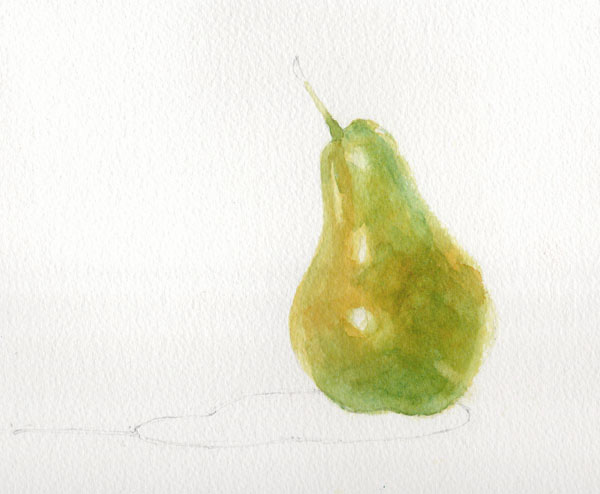
The painting begins with a layer of Transparent Yellow applied with a size 8 round brush.  The brush should always make first contact with the paper where you want the colour to be strongest; do not simply start at the edge of a shape and 'colour in'.  Here the paint goes on first at the bulge of the pear where it is closest to the viewer; this will help create a sense of form and depth.


Before the paint dries, a clean damp brush is used to soften the edges to increase the sense that sides of the pear are receding.  The edges of the reserved highlights are also softened in the same way.


The first layer is allowed to dry thoroughly.  Before moving on, the pencil outline of the pear is carefully erased before further paint and water can seal it in.  A layer of Quinacridone Gold is added to the warmest areas of the pear skin.


In the next layer we can begin to see the effects of glazing with transparent colours.  A wash of Permanent Sap Green is applied to all but the yellowest areas.  On its own, Sap Green would be too cold and harsh but layered over yellow it softens and mellows.  Again the colour is strongest in the centre, softening towards the edges.  The green is carried a little way up the stalk too to aid continuity later.

Once the painting is dry again, Cerulean Blue is added to areas in shadow.  The effect over the previous yellow and green is to produce a dark green.  Cerulean Blue is a granulating colour so as it dries it will help to add texture to the painting.


The delicate dark green mottling on the skin is painted with a size 4 brush in Winsor Blue (Green Shade).  Tiny dots are added first and then immediately softened and blended with clean water.  It is important that the dots are not allowed to dry before they are softened so you need to work on small areas at a time, moving steadily across the painting.


The same technique is then used to add the red mottling. This is predominantly Cadmium Red which is a strong opaque colour and needs to be used with care.  Kept thin and light at the edges it blends into the earlier colours, but used more strongly in the centre, its opacity means it can stay bright zingy red without being compromised by the underlying green.  In areas which need to be less bright but still strong, a little Permanent Alizarin Crimson is used.


The stalk is painted with a size 6 round brush in Burnt Umber with a touch of Winsor Blue (Green Shade) dropped in half way along.  The colour is blended into the flesh of the pear to make sure the stalk grows out from the fruit and is not 'stuck on'.  The very end of the stalk is deliberately blurred with clean water so that the eye is not drawn to a hard edge and distracted from the pear.
The shadow shape is first painted with clean water.  Winsor Blue (G) is then added in the strongest area on the right and coaxed along to the rest of the shadow shape.  While it is still wet some Sap Green, Transparent Yellow and a tiny amount of Cadmium Red are added to the shadow to indicate reflected colour from the pear.  When the shadow is dry, the area immediately under the pear is strengthened with strong mix of Sap Green and Winsor Blue (G).

Pear with Shadow - © Jane Duke 2011


Monday 21 September 2015

Is that art or can we sit on it?

Henry Moore; 'Draped Seated Woman' 1957-8

One of our favourite days out is to the magnificent wonderland that is the Yorkshire Sculpture Park. It is one of those special places which lifts the spirits and cleans the soul. Covering 500 acres, there is more than enough walking to make adult legs, let alone tiny ones, rather weary - which is where the title of this post comes from. "Is that art or can we sit on it?" was asked by our then small daughter on her first visit many years ago. The subject of her query was in fact a bench - though we had to admit it was perhaps more aesthetically pleasing than a couple of the sculptures, so we could understand her confusion. (Since then the phrase has become family code to express..ahem..scepticism about artistic merit. Follow us around a museum or gallery and you might hear us muttering it under our breath to each other - most recently I'm afraid in Tate Modern. So we're philistines. What can I say?). Fortunately there are plenty of places provided around the vast spaces of the park for visitors to sit and rest and enjoy the views.

Last weekend my husband and I (along with a large part of the population of Yorkshire, as it turned out) made a special trip to see the newly installed 'Poppies: Wave', a small part of the extraordinary Blood Swept Lands and Seas of Red installation which was at the Tower of London in 2014.

In the glorious autumn sunshine our first glimpse of the poppies in the distance was like a fiery beacon, reflected in the water below. What a fabulous setting for this stunning display.


Even on a busy day the park is so big it isn't too hard to escape the madding crowd and find some tranquility. On this visit I spent quite some time just gazing at the reflections in the Boat House which houses JocJonJosch's 'Eddy'.


JocJonJosch: 'Eddy' 2014

Another of our favourite spots is James Turrell's 'Deer Shelter Skyspace'. How can a simple* hole in a roof be so effective and mesmerising? But it is - and with the added benefit that this is simultaneously art AND you can sit on it, or at least in it.

James Turrell: 'Deer Shelter Skyspace' 2007


* I have no doubt it isn't simple at all, but very cleverly designed and engineered to achieve the effect it does.

The Poppies will be in place until 10 January 2016, but the Sculpture Park is open all year round and always worth a visit. Entrance is, astonishingly, free - though of course donations are always welcome. The icing, or perhaps gravy, on a great day out is the excellent restaurant which is very good value and serves up a delicious menu.

Pro tips: 
  • Get there as early as you can, especially at the weekends. If you arrive a few minutes before the opening time of 10am you can always set off around the park and open air exhibits before coming back to the visitor centre and indoor galleries.
  • Do pick up a map. You can miss entire sections of the park without one.
  • Parking is by number plate recognition and you can pay at the machines at any time during your visit. Pay early in the day because the queues at the machines can get quite long later. Don't waste time trying to work out how long you will need; just pay for the whole day, you'll use it!

For more information visit www.ysp.co.uk

Sophie Ryder: 'Sitting' 2007

Thursday 17 September 2015

Abbeys - creating a new series of collagraphs

Up to now my collagraphs have tended to be small and detailed, often relying less on the structure of the plate and more on the wiping of the ink. I had an urge to do something a bit bigger and looser, and so the idea of a series of prints of landmarks was born. The first two images which popped into my head were of two of my favourite places in North Yorkshire, which both happen to be ruined abbeys. Here are the finished prints of Whitby Abbey (English Heritage) and Fountains Abbey (National Trust).

Whitby Abbey and Fountains Abbey each 30 x 30 cm

And here's a little about how they are made. The first step is to work out the drawings, thinking all the time of how the layers will need to be built up on the plates and the order in which they will be inked up. Once the drawings are finished they have to be traced onto the pieces of mountboard I'm using as plates (remembering of course to reverse the images!).


Then comes the fun bit of building the plates both by cutting away some parts and by adding collage elements. I use different textures of paper, pieces of fabric and pva glue painted on in lines and smears. It's important to remember these are printmaking plates, not collages, so some parts might be counter-intuitive. For instance look at the middle window on the Fountains Abbey tower on the right; I want to 'see' the sky through this, but instead of cutting away a section of the tower which would then just fill with the ink I use for the stonework and be dark (like the small top window), I have stuck on a piece of plain paper which I will be able to wipe clean and then add a little sky colour at the end.


Once the plate is finished it is varnished with several layers of shellac and left for a couple of days to harden completely. Inking up is a long job and has to be carefully planned (you'll notice planning is a recurring theme in printmaking). There's no point adding ink to one area if it's going to be wiped away when you add another. The photo on the left shows the Whitby Abbey plate with the ink laid on the sky, background and pond. I wipe most of this down before adding the ink to the abbey itself, and then there is a lot of wiping, touching up and more wiping. It takes about an hour to reach the stage in the photo on the right, which is the plate ready for printing.


The really magic moment is when you pass a plate through the press and see for the first time what it looks like as a print. There is always an element of surprise - simply the fact the picture is a mirror image of the plate you have been working on for so long means it looks fresh and new.


Then it's time to clean the plate down, prepare another piece of paper and start inking up all over again.....   I'm planning to get editions of 15 of each print but collagraph plates are fragile things. Look what started to happen to the Fountains Abbey plate after just three prints.


Aaaagh! This will need careful repair and then more varnishing before I can carry on.

And meanwhile I'm thinking about what will be the next prints in this series. All I can tell you for sure is that they will be abbeys or churches. They might be all in Yorkshire.... or they might not. They might all be ruins... or perhaps not. We'll have to see where inspiration strikes. Do you have any suggestions?

Tuesday 8 September 2015

Seven Plums - watercolour demonstration

I recently took down the demonstration pages that had been on my website for several years. They were getting a bit stale and I'm not planning on reproducing them all here. However this was a particularly popular one and I still refer to it in my Watercolour Improvers workshop, so I thought I'd give it a new home here on the blog.


The idea of this demonstration is to show how careful planning of glazes can produce vibrant and fresh colour, even when using all three primaries layered together. The effect you get from layering in this way is completely different from mixing the same paints together on the palette.

For this study of plums I needed a range of hues including yellow, green, red and purple.  I spent some time experimenting with layering different colours and planning the order in which I would work. The chart below shows the colours I planned to use and the swatches along the bottom show the results of the different combinations.The colours would be layered starting with the yellow and working through to the violet, but not all areas would have all the layers or in the same intensity. For instance the yellow is used more lightly in the areas which will also have cobalt blue and violet to avoid the colours turning dirty green.
All paints are Winsor & Newton Artist range.


OK so that's the planning - now for the execution. The first wash is Transparent Yellow.  It is applied lightly in some areas and in others is not used at all, depending on what the eventual colour is to be. The stalks have been protected with blue tinted masking fluid.


Then Cerulean Blue is added. I add this only where I want to achieve swatches 2 and 3 on the chart.


Then Permanent Alizarin Crimson goes where I want to achieve the colour swatches 3 through to 6. Do you see how this is working?


Cadmium Red goes on next...


..then Cobalt Blue...


..and finally Winsor Violet (Dioxazine). There were just a few tiny areas that have been left unpainted until this point so they now have only pure Violet on them (the last swatch on the chart, number 8).


Here's the finished piece with shadows, lace and stalks added.  The shadows and lace holes are all painted with colours used previously (Cobalt Blue, Permanent Alizarin Crimson, Transparent Yellow, Winsor Violet) but because here the paint has been mixed on the palette instead of being painted in layers on the paper, the result is muted neutrals rather than the vibrant colours of the plums

'Seven Plums' - © Jane Duke 2011

I hope you enjoyed this demo and found it useful. Do let me know what you think in the comments below.

The legal copyright bit (sorry but unfortunately this is necessary):
You are very welcome to follow this demonstration for your own pleasure, but please remember that exhibiting or selling the resulting painting without acknowledgement is copyright infringement.

Thursday 20 August 2015

The Most Happy

I love Hampton Court Palace. I mean I really love it. I love it so much I get a bit weepy just walking through the gates. Visiting from York entails a round trip of 500 miles and an overnight stop in a budget hotel, but it's worth every traffic cone and little plastic pot of UHT milk. Just being there makes me 'The most happy', the phrase Queen Anne Boleyn adopted as her motto.*

When we visited last weekend we headed straight for Henry VIII's kitchens, getting there before the crowds who had been waylaid by the signs to the Great Hall. The costumed cooks had just got the huge open fire going and were starting to spit roast a couple of large hunks of meat. The guides told us that the most common question they are asked by visitors is "Is that a real fire?", which is quite shocking and rather sad. I suppose that in a world of central heating and electric ovens, it is possible for people to go through life without ever seeing real flames and so not be sure what a wood fire looks (or sounds or smells or feels) like.

Look! Earthenware, wood, wicker, stone, herbs... so much loveliness.

Rather a blurry action shot, but I love the way it looks like a Brueghel painting.
After the kitchens we moved on 150 years to William III's apartments (also empty - "Everyone goes to the Great Hall first" said a guide, with a hint of sadness) and made an initial foray into the gardens, before we too succumbed to the lure of Tudor apartments and the Great Hall, where we encountered a team of 'Time Players' in period garb performing 'Pastime with Good Company'. The rest of the palace followed after lunch, including George I's Chocolate Kitchens (yes two rooms JUST FOR CHOCOLATE; forget a gift wrapping room, a chocolate kitchen must be the ultimate sign of a luxury home) and more time in the gardens, which now have 500 deckchairs to mark the 500th anniversary of the palace.  We availed ourselves of two for a while. (If you read my blog post about Chirk Castle you might detect a recurring pattern here.)

Why don't more gardens have fantasy beasts on striped poles? They're wonderful.
The sound track for our journey home was a Music for Feasting CD bought in the gift shop - medieval and Tudor smash hits played on period instruments (Now That's What I Call Minstrels). We head banged in the car in Wayne's World fashion and sang along in Latin.

You might have guessed by now that I am a bit of a Tudor nerd, which is one of the reasons that earlier this year I started a series of hand tinted drypoint etchings based on Tudor drawings. The first two I've completed are taken from Holbein sketches of Anne Boleyn and Jane Seymour. The watercolour hand painting of each print, along with the fact that the ink colour is varied for each impression, means that each print is unique (a monoprint). There will be no more than 40 prints in each edition.

Hand tinting an 'Anne Boleyn' etching with watercolour paint.

Tudor Series - drypoint etchings with watercolour tinting
Oil based ink and watercolour on 140lb watercolour paper
Image size 14 x 20.5 cm


*Compare and contrast with the 'Bound to Obey and Serve' motto of her straight-laced successor, Jane Seymour. Oh Henry you silly man.

Tuesday 11 August 2015

Ammonite Giveaway Winner

Thank you so much for all your entries to the giveaway I posted here at the end of July. I was delighted to see so many right answers! The challenge was to watch a short video released by Saltaire Inspired to whet your appetite for September's Makers' Fair, spot me in it and tell me which word appeared on screen at the same time as I did. (As if that wasn't easy enough, I was actually wearing the same top in the video as I am wearing in my current profile pic.)


Here I am, and the word is 'creative'. Using the latest cutting edge competition technology (printing the correct entries on bits of paper and putting them in a bowl), the winner has been selected and...

The independent adjudicator checks everything is in order.

(drum roll)....


...it's Gail Falkingham.
Congratulations Gail, your Ammonite collagraph print is on its way to you!

For everyone else who entered, sorry you didn't win this time, but this series of prints is available online and will of course be at the Saltaire Festival Makers' Fair 12-13 September.

Wednesday 29 July 2015

Can you see me?

I was delighted to hear I am one of the 45 artists and makers selected for the Saltaire Festival Makers' Fair in September. The icing on the cake was finding out that I'm featured in this rather fun little video released to publicise the event (using a pic which must have been taken of me at last year's show). Can you see me? If you can then you could win one of my new Ammonites prints. Watch the video - it's only 30 seconds - then see below for how to enter. (Hint - if we haven't met and you can't see what I look like from the little profile pic here, there's a bigger version on the 'About the Artist' page of my website.)


Once you've spotted me, simply email me with the subject line 'I see you' and tell me which word is on the screen at the same time as I am. A winner will be chosen at random from all correct entries after the closing date which is 10 August 2015.
  • Only one entry per person please
  • The winner will be emailed and asked for their name and postal address so the print can be sent to them. If no reply is received in three days another draw will be made.
  • The winner's name will be published here on the blog
  • All emails will be deleted after the winner has been drawn; your email address will not be saved and will be used only to contact you if you are a winner.
  • The prize will be a print from my Ammonite collagraph monoprints series. (Three different examples are shown below).
Ammonite series mini prints -  each image size 10 x 10 cm

For more information about the Saltaire Festival and the Makers' Fair please visit their website. The Makers' Fair is on 12 and 13 September 2015 in Victoria Hall, Saltaire, West Yorkshire.

The Ammonite prints will be available at the Fair and are currently in my Etsy shop. If you're near York right now you can also see them in the 'Jurassic Coast' exhibition at Blossom Street Gallery until 19 August.

Good luck!

Monday 27 July 2015

Who is Stoneflower Stu?

I’ve used the name Stoneflower Studio for more than seventeen years and quite often I am asked where the name comes from. Equally often, it has to be said, people think I must have meant Sunflower and just call me that instead: amusing when written on an envelope, less funny when written on a cheque. On one memorable occasion, the advertising editor of a local magazine decided I had made a mistake when submitting copy and so helpfully corrected the text to read ‘Sunflower Studio’. To reassure me that it was really no bother she kindly added an image of sunflowers to the background of the ad too. I think she was quite hurt that I didn’t appreciate her efforts.

So anyway how did I start using this name? In 1997 our brand new house was being built, along with several others, on disused industrial land between existing houses.

Autumn 1997
When our neighbours’ properties had been built several decades earlier, the planners had shown a distinct lack of foresight and imagination (or indeed planning, which was their job) and failed to hold back any spare house numbers, so now we would have to be 25a, alongside 25b, 25c, 27a and 27b as well as the original 25 and 27. We anticipated trouble, mis-delivered post and unordered pizzas* so those of us watching our new houses being built decided we needed house names too. After much deliberation I had the stroke of genius which was ‘Stoneflower’. It was so right! It was so perfect! But just as we were about to order a sign and notify Royal Mail and the Fire Service, our children deployed the downcast lashes and small voices tactic and murmured that they’d always liked the name of our old house [insert heart tugging sigh here]. Instant parental deflation was piled onto the guilt already felt at uprooting our six and four year olds from their home 200 miles away and thus the old name, 'Alderley', was duly re-used. What a shame we'd left the house sign behind.

But I still haven’t explained about ‘Stoneflower’. Well it comes from the names of our children – yes that’s right, the ungrateful ones who spurned my suggestion of immortalising them in a slate plaque on the front of the house. Our son is Peter, which I’m sure you know comes from the Ancient Greek ‘Petros’ meaning stone. Our daughter is Poppy, which should not require any explanation for the flower bit. Having come up with such a wonderful, meaningful name (even if this view was not shared by the children), I didn’t want it to go to waste so decided to use it as my business name.

A watercolour I painted of the children in 1998
I have since discovered Stoneflower Studio won’t quite fit on my bank card where the embossing reads STONEFLOWER STU. I rather like the sound of Stoneflower Stu. He sounds cool. I imagine him as a banjo player supporting Seasick Steve on tour. When I joined Twitter I considered becoming StoneflowerStu but settled for @stoneflowerjane. Perhaps I should give Stoneflower Stu his own account. I wonder what he would tweet about?

*By the way we were proved right. And having house names didn’t help after all.

Wednesday 22 July 2015

Robin Nest - printing a collagraph

One of the most common questions I get asked at shows is "How long does one of these take you?". The poor unsuspecting enquirer is probably expecting a simple two word answer starting with a number and ending with a unit of time, but I'm afraid instead they get an explanation of the many variables of printmaking. I try to stop talking before their eyes glaze over too much.

With some forms of printmaking, the time-consuming bit is carving and creating the plates from which the print is made, while the actual printing is a relatively quick whizz with an ink roller and a pass through a press. With others the plate might be fairly simple, but inking up for each individual print is a slow and painstaking job. The collagraph print I'm going to show you here is one of the latter. The plate was made from a piece of mountboard (or matboard if you're in the US); some parts were incised to remove the top layer while in other areas texture was created by sticking on elements including thread, paper shapes and lines of pva glue. Once finished the plate was sealed with several coats of shellac.


The first colour to be applied was a pale green blue for the twigs in the nest. This had to be pushed right down into the incised areas so I used a toothbrush to work it in. The ink was the thick and sticky consistency you would use for other intaglio methods (eg etching) so it would stay where it was put and not be easily wiped out again.


I didn't want much of this colour on the surface of the plate so I wiped the excess off with a piece of scrim and to make some of the marks even clearer I cleaned up around the edges with a cotton bud.


Then I added a green ink with a roller. Now I was working in a relief method so the ink just lay on the raised surfaces not in the indentations. The ink was loosened to a relief printing consistency for this using an extender. After inking, the outer area was softened and blurred by wiping with scrim, while the centre part was cleaned up with a rag to remove as much ink as possible


The middle of the plate was now inked up with a brown colour. This was another time that I needed the ink to be pushed right down into the nooks and crannies, so I used a poupée; meaning 'doll' in French, this is a thick soft stump made by screwing a piece of rag into a ball and then wrapping and taping or tying another piece round it.


Then I used another piece of clean rag to take the brown ink off the paper eggs in the centre and yet another to wipe some pale blue ink directly onto them. (Worn out shirts never get wasted here.)


Finally, after around half an hour of adding and wiping ink the plate was ready....


... to be passed through the etching press with a piece of dampened printmaking paper, and a print was pulled.


And then it was time to clean up the plate and do it all over again. After seven prints the fragile plate began to degrade and that was the end of the edition. Each print inevitably came out differently so the prints are numbered with the annotation 'VE' for 'variable edition'.